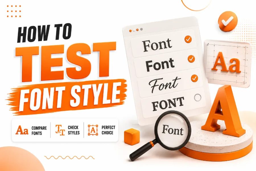
How to test font style starts with one simple question: can your audience read, understand, and trust the text without effort? A font may look attractive in a preview, but it can fail once you place it inside a website, logo, social post, app screen, printed card, or long article. This guide shows you how to test fonts with real content, real sizes, real layouts, and real user expectations before you make a final design choice.
Start With The Purpose Of The Font
A font style should match the job it needs to perform, because a headline font, body font, logo font, and decorative font do not carry the same responsibility. Before you test anything, define whether the font should feel professional, playful, bold, elegant, futuristic, vintage, friendly, or premium, because that purpose will guide every design decision. A simple creative preview tool can help during early exploration, and a font generator for stylish text and creative fonts gives you a fast way to compare decorative styles before choosing which ones deserve deeper testing.
The mistake many people make is testing a font by looking at a single word in a large size, which hides problems that appear under normal reading conditions. Instead, test the font in the same environment where your audience will see it, including mobile screens, desktop pages, printed materials, and social media graphics. A font that works for a short logo may not work for a 1,500-word blog post, so judge every style by its real purpose, not by its first impression.
How To Test Font Style With Real Content
How to test font style properly means replacing sample text with the exact kind of copy your audience will read. Use headlines, product names, menu labels, captions, form fields, call-to-action buttons, and body paragraphs, because each format exposes different strengths and weaknesses. If the font makes short words look sharp but turns longer sentences into visual noise, it may be better for display use than regular reading.
Real content also reveals whether the font supports your tone, because typography can make the same sentence feel serious, relaxed, expensive, casual, or childish. Test names, numbers, punctuation, uppercase letters, lowercase letters, and common symbols, especially if your design includes prices, dates, addresses, or technical details. This step helps you avoid fonts that look impressive in a demo but become confusing in practical communication.
Check Readability At Common Sizes
A readable font must stay clear at the sizes people actually use, not only at large promotional sizes. Use 16px for body text on web pages, smaller caption sizes for supporting details, and larger sizes for headings, because each size reveals different spacing, shape, and weight issues. A themed display tool, such as a pirate font generator, is useful when you want adventurous lettering for playful titles, but decorative styles still need to be size-tested before they appear in banners, profile names, or themed graphics.
Small text is where weak fonts usually fail first, because tight spacing, thin strokes, and unusual letter shapes can make reading feel slow. Increase and decrease the font size while reading a full paragraph aloud, then notice where your eyes begin to strain or skip words. If the font loses clarity too quickly, reserve it for large headings or replace it with a stronger typeface for body copy.
Test Spacing Between Letters And Words
Spacing determines whether a font feels polished or uncomfortable, because even beautiful letters can become difficult to read when they sit too close together or too far apart. Look closely at pairs such as AV, WA, To, Yo, and Ta, because these combinations often reveal awkward gaps or crowding. A niche tool such as a wedding font generator can inspire elegant lettering for invitations and romantic designs, but graceful fonts still need spacing checks so names, dates, and venue details remain clear.
Word spacing matters just as much as letter spacing, especially in paragraphs where readers need a steady rhythm. If words look disconnected, the text feels scattered, but if words feel squeezed, the paragraph becomes tiring. Good spacing should allow your eyes to move smoothly from one word to the next without stopping to decode the shapes.
Compare The Font In Different Weights
A font family often includes regular, medium, semibold, bold, italic, and sometimes extra-light or black weights, and each weight should be tested separately. The regular weight may work well for paragraphs, while the bold weight looks too heavy, or the italic style may become hard to read in longer phrases. Testing weights helps you build a complete typography system rather than choosing a single style and hoping it works everywhere.
Use the same sentence across all weights to keep the comparison fair and focused. Check whether bold headings provide enough contrast without appearing aggressive, and ensure lighter weights do not disappear on mobile screens. If a font has limited weights, you may struggle to create a clear hierarchy, so choose a family that gives you enough flexibility for headings, subheadings, body text, and buttons.
Examine Letter Shapes And Similar Characters
Some fonts fail because important characters look too similar, especially when readers scan quickly. Compare uppercase I, lowercase l, the number 1, uppercase O, zero, lowercase a, and lowercase g, because confusing shapes can hurt usability in passwords, codes, addresses, product names, and technical content. A font that looks stylish but causes readers to misread key information creates a design problem, not a branding advantage.
You should also check punctuation marks, quotation marks, commas, periods, apostrophes, and currency symbols. These small details appear often in real writing, and weak punctuation can make a professional layout look unfinished. If your content includes data, pricing, schedules, or measurements, test numbers carefully because clear numerals are essential for trust and comprehension.
Review Contrast Against Backgrounds
A font style cannot be tested without its background, because color and contrast affect readability as much as letter shape. Place the font on white, black, light gray, dark gray, brand colors, image backgrounds, gradients, and textured designs to see where it remains clear. A font with thin strokes may look elegant on a white background but disappear when placed over a photo or bright color.
For accessible web design, normal text should usually have strong contrast, and many designers use the 4.5:1 contrast ratio as a practical minimum for body copy. Large headings can sometimes work with slightly lower contrast, but you should still prioritize clarity over decoration. If people must zoom in, squint, or reread the text, the font-and-color combination needs adjustment.
Test The Font On Mobile Screens
Mobile testing is essential because many readers will see your design on a small screen before they ever view it on a desktop. Open your layout on different phone sizes and check whether headings wrap cleanly, buttons remain readable, and body text keeps enough breathing room. A font that looks balanced on a wide monitor can feel cramped when the line length becomes narrow.
Pay attention to tap targets, menus, form labels, and short interface text because mobile users often scan quickly. If the font has dramatic shapes, condensed letters, or very thin lines, it may lose clarity on high-density screens or under poor lighting. The safest choice is a font that keeps its personality while still allowing users to read without effort.
Measure Line Height And Paragraph Flow
Line height controls the vertical space between lines, and it can make a paragraph feel either calm or crowded. If line height is too tight, readers may jump to the wrong line, but if it is too loose, the paragraph can feel disconnected. Test the font with multiple paragraph lengths so you can see whether the reading rhythm stays comfortable.
A practical starting point for body text is a line height around 1.4 to 1.6 times the font size, though the best setting depends on the typeface. Fonts with tall x-heights may need different spacing than fonts with dramatic ascenders and descenders. The goal is simple: each line should feel connected to the next without making the reader work too hard.
Build A Clear Font Hierarchy
A strong font style works inside a hierarchy, not in isolation, because readers need to know what to read first, second, and third. Test your H1, H2, H3, body text, captions, and buttons together on one page so you can judge the full visual system. If everything looks equally loud, nothing feels important, and your design becomes harder to scan.
Use size, weight, spacing, and contrast to guide attention instead of relying on too many different fonts. One or two typefaces are usually enough for a clean layout, especially when the chosen family includes several usable weights. When your hierarchy is working, readers can understand the structure of the page before they read every word.
Ask Real Users To Read It
Your personal taste matters, but your audience’s reading experience matters more. Give a few people the design and ask them to read a headline, scan a section, complete a form, or identify a button without explaining what you want them to notice. Their hesitation, confusion, or repeated questions will often reveal font issues you may have missed.
Keep the test simple and practical, because you do not need a large research study to spot obvious readability problems. Ask whether the text feels easy, professional, friendly, trustworthy, or difficult, depending on the goal of the design. If several people describe the font as hard to read, too fancy, too small, or too busy, treat that feedback as useful evidence.
Use Simple Reading Tasks
Give readers a short task rather than asking only whether they like the font, because people often prioritize style over usability when the question is too broad. Ask them to find a price, read a paragraph, compare two headings, or complete a sign-up form. Their actions will show whether the font supports the design or slows it down.
Check Font Quality Before Final Use
Font quality affects the final result, especially when you use the typeface across a full website, brand identity, or marketing campaign. Zoom in and inspect curves, strokes, spacing, and difficult letter combinations, because poor construction can make a font look amateur even when the overall style seems attractive. Good fonts usually show consistent shapes, balanced spacing, smooth curves, and reliable performance across a range of sizes.
You should also consider the font’s source, licensing rules, available formats, language support, and whether it includes the characters your project needs. A free font can be useful, but it still needs to be checked for commercial use, punctuation, symbols, and long-term reliability. If the font will represent a business, product, or publication, quality control should happen before launch, not after readers notice the problem.
Create A Final Font Testing Checklist
A checklist helps you make a confident decision instead of relying on taste alone. Before publishing, test the font with real content, common sizes, multiple weights, mobile screens, background colors, paragraph layouts, headings, buttons, numbers, punctuation, and user feedback. This process gives you a practical view of how the font performs in the real world.
You should also compare the font against at least two alternatives, because comparison makes strengths and weaknesses easier to see. Save screenshots of each version and review them side by side after a short break, because fresh eyes often catch issues you missed earlier. The best font is not always the most decorative; it is the one that conveys meaning, improves readability, and fits the design goal.
Conclusion
How to test font style is about more than choosing a font that looks attractive in a preview box. You need to test purpose, readability, spacing, size, contrast, mobile performance, hierarchy, user response, and font quality before using it in a serious design. When you follow this process, you avoid weak typography choices that make content harder to read or damage the professional look of your brand.
A strong font should help people understand your message faster, not distract them from it. Test it with real words, real layouts, and real readers before making your final decision. Once the font proves that it is readable, flexible, accessible, and aligned with your tone, you can use it with much greater confidence.