What font does YouTube use is a common question because the platform looks simple, but its typography system is more layered than one single font. YouTube uses different fonts for different jobs, including Roboto for many interface areas, a custom logo style influenced by Alternate Gothic, and YouTube Sans for branded display moments across products and campaigns.
Once you understand where each typeface fits, you can make smarter choices for thumbnails, channel banners, websites, apps, and brand designs that need to feel clear, modern, and instantly recognizable.
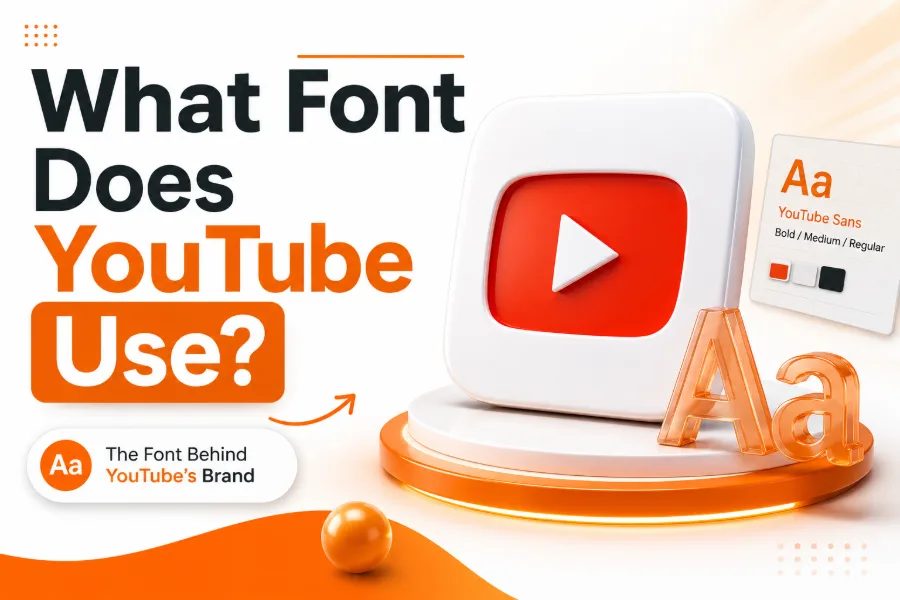
What Font Does YouTube Use In Different Places?
YouTube does not rely on one typeface for everything, because a video platform needs readable text, strong branding, and consistent product design at the same time. Roboto appears across many interface areas because it performs well on screens, while YouTube Sans gives the brand a more ownable voice in headlines and marketing. When you want to experiment with similar display styles for names, banners, or social graphics, a font generator for stylish text and creative fonts can help you test decorative looks before choosing a cleaner font system for serious brand use.
The easiest way to understand YouTube’s typography is to separate function from identity. The functional layer supports video titles, descriptions, comments, menus, and buttons, so it must stay readable even on small screens. The identity layer supports the logo, campaigns, product families, and major announcements, so it can carry more personality without making everyday browsing harder.
Why Roboto Works For YouTube’s Interface
Roboto became a strong fit for YouTube because it balances friendliness with structure, which matters when millions of people scan titles, menus, captions, and comments every day. It has open shapes, steady spacing, and a neutral appearance that keeps the content in front instead of making the interface feel loud. That matters because YouTube’s main product is not typography itself; it is the fast discovery of videos, creators, playlists, and recommendations.
For creators, the lesson is clear: your main text font should help people understand your content quickly. A readable font is usually better than a dramatic font for body copy, descriptions, channel pages, and website sections connected to your videos. If viewers need extra effort to read your titles or navigation, the design may look creative but still hurt the user experience.
The YouTube Logo Font Explained
The YouTube logo has a different purpose from the interface, so it uses a stronger and more condensed visual style. Its wordmark is commonly connected to a modified Alternate Gothic influence, with a bold structure that helps the brand stay recognizable beside the red play-button icon. This approach shows why a logo font can be more distinctive than a UI font, as long as the brand keeps the rest of the reading experience simple and clean.
A good logo font creates memory, not just decoration. For example, a themed tool like a slanted font generator is useful when you want angled text for a specific creative effect, but a permanent logo still needs balance, legibility, and long-term recognition. YouTube’s wordmark works because it is direct, compact, and easy to identify across thumbnails, app icons, TV screens, and mobile layouts.
What YouTube Sans Adds To The Brand
YouTube Sans is the custom typeface created to give YouTube a more unified brand language beyond the logo. It takes inspiration from the geometry and energy of the play icon, which helps the typeface feel connected to the platform without copying the logo itself. This matters because YouTube has many products, including entertainment, music, kids, television, creator tools, and premium experiences that need to feel related.
Custom typography helps a large brand look consistent when it moves across devices and campaigns. A niche tool such as a sports font generator can create athletic text for team graphics or themed posts, but YouTube Sans has a broader job because it must support a global product ecosystem. It gives YouTube a flexible display voice while Roboto and other practical text choices keep the daily interface usable.
YouTube Sans Versus Roboto
Roboto and YouTube Sans should not be confused, because they solve different design problems. Roboto is practical, familiar, and ideal for readable interface text, while YouTube Sans is more expressive and better suited for display moments, brand messages, and large-format communication. This difference is the reason YouTube can feel clean in the app and still feel bold in marketing.
You can think of Roboto as the quiet guide and YouTube Sans as the brand speaker. The guide helps users move through menus, read descriptions, follow comments, and understand controls without distraction. The brand speaker appears when YouTube wants to communicate identity, energy, and ownership, especially across campaigns or product extensions where a generic font would feel less memorable.
Why YouTube Needed More Than One Typeface
A platform as large as YouTube cannot depend on a single font choice for every situation. Small text needs clarity, headlines need personality, buttons need speed, and logos need recognition, so the brand requires a typography system rather than a single decorative answer. That is why the best answer to the keyword is not just one name, but a short map of where each font appears.
This also explains why copying YouTube’s fonts does not automatically create a YouTube-level brand. The real strength comes from hierarchy, consistency, spacing, contrast, and knowing which font should do which job. When you build your own design system, choose a readable interface font first, then add a display font only where it strengthens the message.
Typography Lessons Creators Can Learn From YouTube
YouTube’s type choices teach you that clarity should come before style in most public-facing designs. Your video thumbnails can use strong lettering, but your channel description, website copy, and product pages should remain easy to read on phones. If your audience has to pinch, pause, or guess what your text says, the design is working against your content.
You can still build personality without sacrificing readability. Use heavier weights for emphasis, clear contrast for titles, and enough spacing so letters do not fight each other. The best creator branding feels consistent across thumbnails, banners, short-form clips, and landing pages, but it also knows when to stay quiet so the message can breathe.
How To Choose A YouTube Style Font For Thumbnails
A YouTube-style thumbnail font should be bold, simple, and readable at small sizes. Many successful thumbnails use condensed sans-serif fonts because they save space and create impact without adding too many decorative details. However, the best font choice still depends on your niche, because gaming, finance, beauty, education, and comedy channels all need different emotional signals.
Practical Thumbnail Font Rules
Use fewer words, larger letters, and stronger contrast when your thumbnail must compete in a crowded feed. Avoid thin scripts, overly detailed novelty fonts, and tight spacing because they often collapse on mobile screens. Test your thumbnail at a small preview size before publishing, because that is closer to how many viewers will actually see it.
How YouTube Typography Supports User Experience
YouTube’s typography supports speed, and speed is central to the platform’s user experience. Viewers often make decisions in seconds, so titles, tabs, labels, and controls must be readable without slowing down the browsing flow. A clear font helps users understand what to click, what to watch, and what to ignore.
Good typography also reduces visual fatigue. When a platform serves long sessions, dark mode, captions, live chat, recommendations, and community posts, poor spacing or weak contrast can quickly become annoying. YouTube’s type system shows how design can feel invisible in a good way, because users notice the videos more than the interface.
Common Mistakes When Copying YouTube’s Font Style
The first mistake is assuming the logo font should be used everywhere. A condensed logo-style font may look strong in a brand mark, but it can become tiring when used for long paragraphs, navigation labels, or detailed captions. YouTube avoids that problem by separating brand identity from everyday reading.
The second mistake is using bold display fonts without enough spacing or contrast. A font can look powerful in a design file and still fail when placed over a busy thumbnail image. The third mistake is ignoring mobile previews, even though many viewers discover videos on small screens where every letter needs to stay clear.
Accessibility And Readability Matter Most
Typography is not only a style decision; it is also an accessibility decision. Clear fonts, proper spacing, strong contrast, and predictable hierarchy help more people understand your content, including viewers with low vision or people watching on smaller devices. A font that looks unique but reduces readability can quietly damage engagement.
Accessibility also affects trust. When your text is easy to read, your brand feels more professional and less stressful to use. YouTube’s system proves that the best typography often disappears into the experience, helping people move through content smoothly instead of forcing them to admire the font.
Final Takeaway For Creators And Brands
The smartest lesson from YouTube is to build a type system, not just pick a trendy font. Use one readable font for interface-style content, one stronger font for headlines or thumbnails, and a consistent logo style that people can recognize over time. This gives your brand flexibility without making every page, post, or graphic feel disconnected.
Keep your font choices simple until your brand has a clear reason to expand. Too many typefaces can make a channel or website look messy, even when each font looks good alone. If you treat typography as a practical system, you can create a design that feels polished, fast, and memorable.
Conclusion
What font does YouTube use has a more useful answer when you look at the whole system instead of searching for one magic typeface. YouTube uses Roboto for many readable interface areas, a logo style shaped by a modified Alternate Gothic direction, and YouTube Sans as a custom brand typeface for stronger display and product identity.
That mix works because each font has a specific job: one helps people read, one helps people recognize the brand, and one helps YouTube express its personality across a growing family of services. If you are designing thumbnails, a channel identity, an app, or a website, the main lesson is to match the font to the job. Choose clarity for daily reading, impact for display text, and consistency for long-term brand memory, because great typography should make your message easier to notice, trust, and remember.