What is the most professional font is a practical question because the typeface you choose can influence trust before readers study your message closely. A polished font makes your resume easier to scan, your website easier to read, your presentation easier to follow, and your brand feel more reliable.
The best choice is not always the trendiest font; it is the font that supports your purpose, matches your audience, reflects your industry, and stays readable wherever your content appears, from a phone screen to a printed proposal for busy readers. Keep reading for more information on this topic!
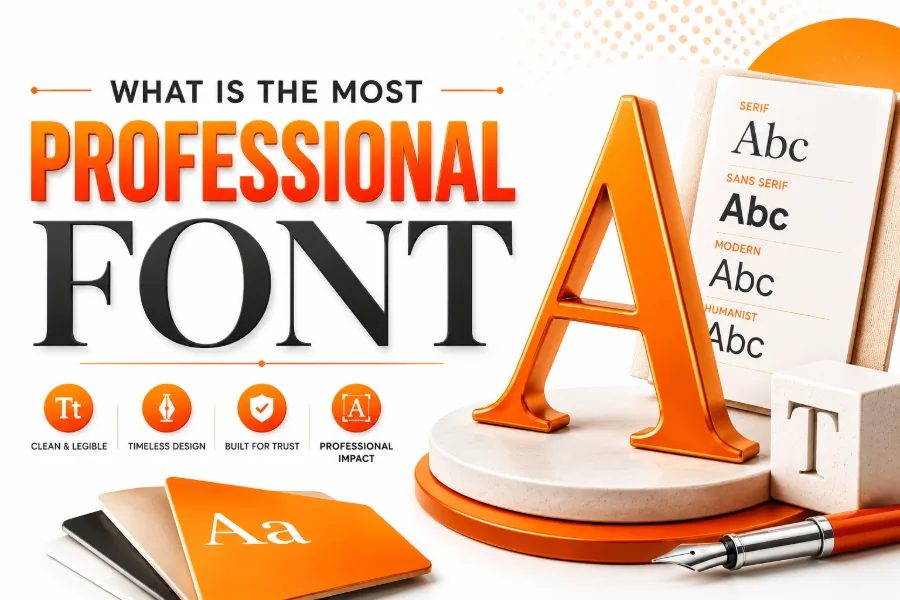
What Makes A Font Look Professional?
A professional font looks clean, balanced, and readable, even when someone is scanning a document, web page, or slide under time pressure. When you want to test decorative styles for non-official text, a tool like font generator for stylish text and creative fonts helps you compare expressive lettering without replacing the serious font used for your main content. This separation matters because formal typography should protect clarity, while creative lettering should appear only where personality is useful and expected.
Clarity Comes Before Style
The best professional fonts have steady spacing, open letter shapes, and clear differences between similar characters, such as uppercase I, lowercase l, and the number 1. They do not make readers pause, guess, or work harder than necessary to understand ordinary sentences. If a font makes long text feel calm, organized, and easy to follow, it is already doing its most important job.
What Is The Most Professional Font For Most Projects?
What is the most professional font for most projects? Helvetica is often treated as the safest answer because it is neutral, familiar, disciplined, and useful across corporate websites, presentations, apps, signs, and brand systems. Still, Arial, Inter, Roboto, Open Sans, Lato, Source Sans Pro, and Segoe UI can look just as professional when your priority is dependable readability on screens and business documents.
Serif Or Sans Serif: Which Looks More Professional?
Sans serif fonts usually feel modern, direct, and screen-friendly, so they work well for websites, dashboards, resumes, healthcare pages, education platforms, and technology brands. Decorative type has a different purpose, so a latin font generator is more suitable for styled lettering with a classical or historical feel than for long professional body copy. This difference helps you avoid using an expressive font where readers expect quick scanning, clear navigation, and a trustworthy business tone.
Serif fonts can look equally professional when your goal is authority, tradition, elegance, or editorial depth. Garamond, Baskerville, Georgia, Merriweather, Lora, Source Serif, Cambria, and Times New Roman can suit reports, legal pages, academic documents, financial writing, books, and long-form articles. The smart decision is not serif versus sans serif as a rule; it is whether the font supports the reader’s task and the emotion your project needs.
Use Case Matters More Than Font Popularity
A font can be excellent in one setting and weak in another because reading conditions change across resumes, mobile screens, printed proposals, and slide decks. A themed option such as a wedding font generator fits invitations, name cards, romantic graphics, and celebratory text, but that decorative mood would distract from a corporate report or medical website. This is why professional font selection starts with where the font will appear, who will read it, and how quickly they need to understand the message.
For resumes, the best font is simple, space-efficient, and compatible with hiring workflows. For websites, the best font renders cleanly across browsers, loads quickly, and stays readable on phones. For presentations, the best font has strong shapes at large sizes so the audience can read titles, numbers, and labels from a distance.
Best Professional Sans Serif Fonts
Helvetica remains one of the most professional sans serif fonts because it looks neutral, disciplined, and familiar across many industries. Arial is less distinctive but highly practical because it is widely available, dependable in office files, and easy for most readers to process. Roboto, Open Sans, Lato, Montserrat, Inter, Source Sans Pro, Segoe UI, Work Sans, and Public Sans are strong modern alternatives when you want a digital-first font system.
The best sans serif fonts usually share open counters, even spacing, usable bold weights, and a calm personality that does not fight the message. Montserrat and Poppins can bring a geometric, modern feel to headings, while Open Sans and Roboto often perform better for long text. For most business writing, choose one sans serif family with regular, medium, semibold, and bold weights, then use size and spacing to create structure.
Best Professional Serif Fonts
Serif fonts work well when you want writing to feel established, thoughtful, premium, or formal. Garamond feels elegant and literary, Baskerville feels refined, Georgia feels readable on screens, Merriweather feels sturdy for long digital reading, and Cambria feels familiar in formal documents. Lora and Source Serif are especially useful when you want a traditional tone without making a website or article feel outdated.
Best Font For A Resume
The best resume font helps recruiters read fast, compare details, and notice your qualifications instead of your formatting. Calibri, Arial, Helvetica, Garamond, Cambria, Georgia, Lato, Open Sans, and Times New Roman can all look professional if the layout is clean and the spacing is controlled. Avoid playful, narrow, decorative, or experimental fonts because they can make a serious resume look careless.
Best Font For A Business Website
A business website font must build trust while supporting speed, accessibility, and responsive design. Sans serif fonts such as Inter, Roboto, Open Sans, Lato, Arial, Helvetica, and Source Sans Pro are reliable for service pages, pricing pages, SaaS websites, healthcare websites, and professional portfolios. Serif fonts such as Lora, Georgia, Merriweather, and Source Serif can work well for blogs, editorial brands, law firms, consultants, and education sites.
Best Font For Presentations
Presentation fonts must be readable from a distance, clear on projectors, and strong enough to support short statements. Aptos, Arial, Helvetica, Segoe UI, Roboto, Open Sans, Montserrat, Lato, and Futura-inspired fonts can work well when slides rely on concise wording and large type. Avoid thin weights, condensed styles, and decorative scripts because they lose clarity quickly when projected or viewed on smaller screens.
For slide decks, font hierarchy matters more than decoration. Use one bold style for titles, one readable style for body text, and one consistent treatment for numbers, captions, or labels. If your audience can understand a slide in a few seconds, your font choice is supporting the presentation instead of competing with it.
Best Font For Branding And Logos
Brand typography can be more expressive than document typography, but it still needs discipline. A law firm, hospital, finance company, or B2B software brand usually benefits from clean, confident fonts that communicate stability, while a fashion, hospitality, or creative brand may use more distinctive letterforms. The most professional brand font is the one that matches the business promise and works across the logo, website, ads, packaging, and customer documents.
Font Pairing Rules That Keep Design Clean
Font pairing works when each font has a clear job. A strong combination might use a refined serif for headings and a simple sans serif for body text, or a geometric sans serif for headings and a humanist sans serif for paragraphs. The goal is contrast with harmony, not a collection of unrelated typefaces that pull attention away from the message.
Limit most professional projects to two font families and three or four weights. If you need visual variety, adjust size, line height, letter spacing, weight, and color before adding another font. This keeps the design organized and helps readers focus on the message rather than noticing every typographic decision.
Accessibility And Readability Checks
Professional typography should be accessible because business communication must work for as many readers as possible. Choose fonts with clear letter shapes, generous spacing, and strong weight options, then avoid weak contrast between text and background. A font that looks elegant but becomes difficult for older readers, mobile users, or people with visual fatigue is not truly professional.
Readability also depends on line length, line height, and paragraph spacing. Long lines tire the eye, tight line height makes paragraphs crowded, and weak contrast can make even a good font hard to read. Test your font on phones, tablets, laptops, printed pages, and dark backgrounds before deciding it is ready for professional use.
Common Font Mistakes To Avoid
The most common mistake is choosing a font because it looks interesting instead of because it fits the reader’s task. Comic-style fonts, extreme scripts, novelty display fonts, and overly decorative typefaces can make a business message feel less credible. Even beautiful fonts can look unprofessional when they are used at the wrong size, paired poorly, or stretched beyond their purpose.
Another mistake is using too many fonts in one project. Every extra font adds another voice, and too many voices make a page feel messy even when the writing is strong. A cleaner system with one or two excellent fonts usually looks more expensive, more intentional, and more trustworthy than a design filled with random variety.
How To Choose The Most Professional Font
Start by defining the tone you need: formal, modern, warm, technical, premium, creative, academic, or approachable. Then choose a font category that supports that tone, such as a neutral sans serif for clarity, a humanist sans serif for friendliness, or a serif for authority and tradition. After that, test the font in real headings, paragraphs, buttons, and file formats instead of judging it from a sample alphabet.
A practical decision-making process prevents overthinking. Ask whether the font is readable, appropriate for your industry, flexible across formats, consistent with your brand, and available for legal use in the project. If it passes those checks, it is likely more professional than a fashionable font that only looks impressive in a preview.
Conclusion
What is the most professional font depends on your project, but the strongest answer is a readable, flexible font that matches the tone your audience expects, and that means clarity should guide every choice before style, novelty, or personal taste. Helvetica, Arial, Roboto, Open Sans, Lato, Inter, Source Sans Pro, Georgia, Garamond, Lora, and Merriweather can all look professional when you use them with the right spacing, hierarchy, contrast, and context.
Choose a sans serif when you need modern clarity, choose a serif when you need authority or elegance, and avoid decorative fonts for serious body text because the real mark of a professional font is how easily it helps people trust, read, understand, and remember your message across every serious business touchpoint.